How to choose a color scheme for your website
I was recently given what many would assume to be “the dream job” for a designer - a complete blank slate website AND logo redesign. The client was not married to any particular colors or any aspect of the current site and logo. With no jumping off point, it can be easy to feel overwhelmed by the literally millions of different directions it could go. Without a plan, this can be exceptionally challenging. With a plan though, it can be a lot of fun and super rewarding.
Here’s the thing: oftentimes it’s hard to know what we want until we see it. That’s why I have a multi-step approach for both my brand and web design projects. I start out with the basics - nailing down that style guide. To begin this process, I take some time to get to know my client and their business. I then create 3 different design directions, and based on my client’s input, we are able to narrow it down to get that pitch-perfect style guide that’s ready for business.
The amazing thing about style guides is that they can become a compass, if you will, for your brand. Everything else just falls into place - your website, marketing materials, signage, packaging, and more. And no, you don’t have to be a creative business to have a style guide. Everyone should have one!
Today I’ll be talking about setting the colors for that style guide, and in the coming weeks I’ll go over other two important elements of your style guide: typography and logo assets.
So let’s start with the fun stuff. COLOR! Are you ready to get inspired? Read on!
Pin this!
Save this article to read later
Where to look for color inspiration
Pinterest boards, websites you like, fashion, design books, the paint chip section at Home Depot, nature - you name it. Your color palette inspiration can come from anywhere. Let yourself sit with it for a bit, and you’ll start to notice what colors you are attracted to and that feel like “you.” Snap pictures, make notes, or create a Pinterest board to get started.
What colors represent your brand?
For my brand, I knew I wanted to incorporate a bit of green thanks to my name (Wisteria). I was inspired by the thriving wisteria vines I have growing over the pergola in my backyard, and much like your online presence, with a bit of nurturing you can watch those vines grow and spread to reach more people. I always feel like green tones have such a feeling of hope, growth, and an organic element I just personally love. There - that’s my poetic reasoning behind the green in my palette!
Selecting colors that work together
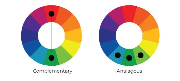
With your main color in mind, I spread the palette to include 3-4 more colors for my scheme. You might remember the terms “analogous colors” and “complementary colors” from middle school art class. Here’s a little diagram to jog your memory.
Keep the color wheel in mind as you are selecting your additional colors. You can decide whether you like the feel of analogous or complementary colors best for your brand.
What I like to do once I’ve nailed down my top 3-4 colors is then add a lighter (or darker) version of each one. In anything you design, it is important to have contrasting colors at your fingertips to add visual interest. For example, you might like to have a light pastel version of your main brand color to use as a background color of your website, or you might like to have a darker color to add a big, bold button. Which brings me to…
Adding a POP of color to your palette
Lay out your colors, and make sure you have one that snaps. That zings. That stands out just a bit above the rest. For me, this color is my personal favorite color - burnt orange. It’s on the other side of the color wheel from green, it’s bold, and it pops. If you selected a more analogous color scheme, this pop should be complementary (i.e. the opposite side of the color wheel).
PS: Your pop doesn’t necessarily have to be a color. If your color scheme is very neutral or pastel, black or navy can be a good pop!
The main thing is you want to look for is a bold contrast, and here’s why: Your pop of color has power. When you use it sparingly and only for the items you want to really draw your viewers attention to - like announcements or call to action (CTA) buttons, you can help lead your visitors where you want them to go.
Know the emotions of different colors
Did you know different colors carry different feeling and emotions with them? And these feelings change from culture to culture. For example, you may not want to use the color red here in the United States for things pertaining to money, as often our connotation with the color is that of a negative checking account balance. But did you know in China that the color red signifies prosperity and good fortune?
Here are few examples of emotions different colors can bring:
Red: passionate, confident, energetic
Pink: fun, loving, nurturing
Orange: optimistic, joyful, adventurous
Yellow: youthful, happy, warm
Green: prosperous, balanced, growth
Blue: successful, trustful, pure
Purple: creative, original, dignified
Black: serious, classic, traditional
Neutrals: calm, organic, comfortable
Gold: prestigious, expensive, elegant
Pastels: playful, friendly, approachable
Think about the impression you’d like to leave your ideal client with, and keep this in mind as you choose your color palette.
Your color scheme should express YOU and your brand!
I hope this goes without saying, but please be sure to select a color scheme that speaks to you and your unique brand. If you think that all wedding photographers have millennial blush websites so you need to as well, think again. Ask yourself if you truly like those colors and think they fit your brand, or if you are just copying the trend. Be yourself, don’t be afraid of color, and have fun. Setting up this part of your style guide will help streamline the designing of other parts of your business, so it’s important that it truly reflects the message you want to deliver to your customers.
What colors speak to you?
Was this helpful? I’d love to hear what you think! Please feel free to leave me a comment or shoot me an email. Chat soon!


